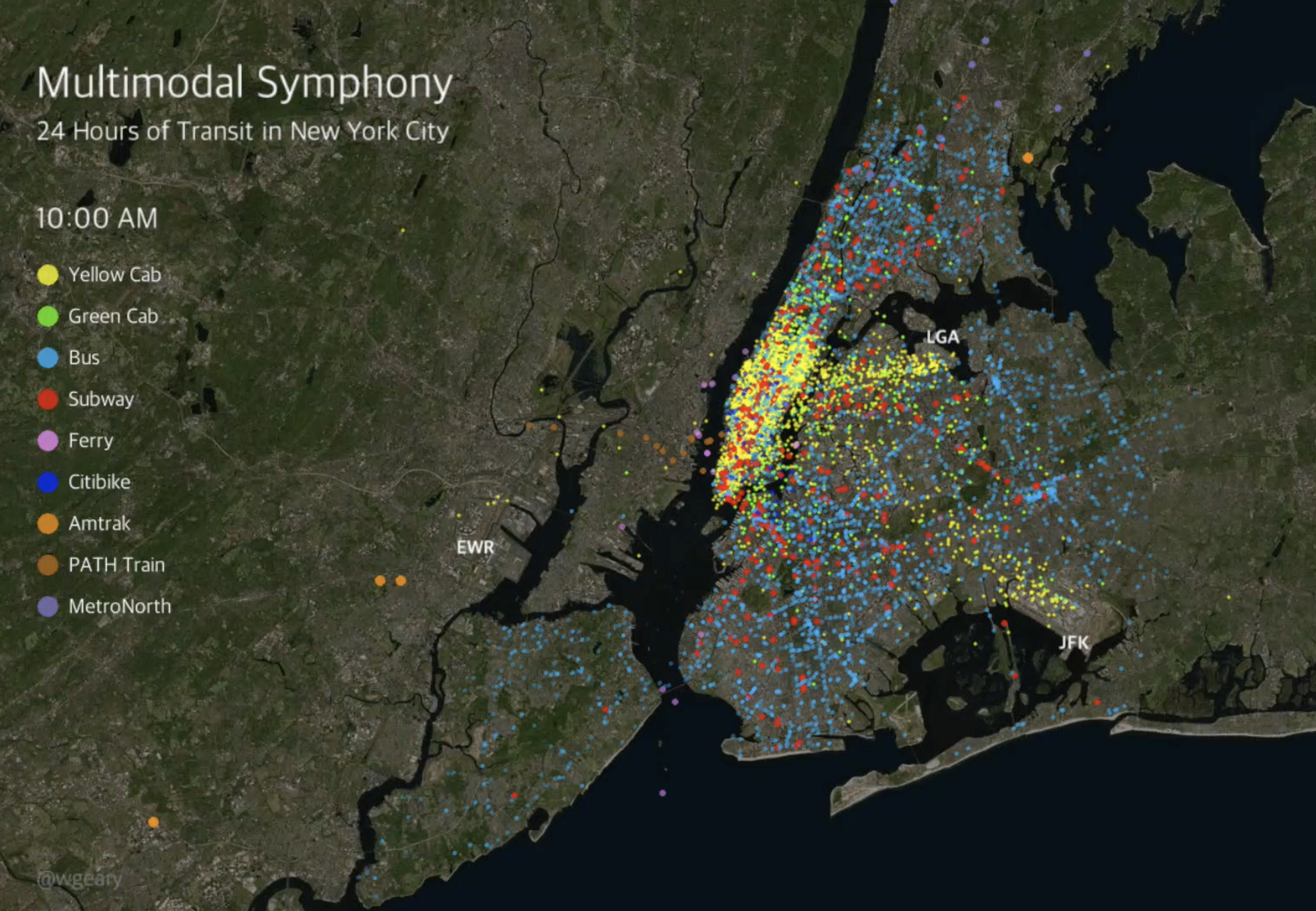
Multimodal Symphony
Animating 24 hours of transportation flows in New York City
About
This project represents my attempt to visualize a "bird's eye view" of New York City transportation flows using publicly available data.
Here is the full video:
Data sources:
- Taxi trips
- Citibike trips
- GTFS data for Subway, Bus, and Metro-North
- GTFS data for Amtrak
- GTFS data for PATH train
- GTFS data for Staten Island Ferry
- GTFS data for NYC Ferries
Methodology:
I followed Todd Schneider’s excellent documentation to download the NYC Taxi dataset and load it into a PostgreSQL database with PostGIS extension. I wrote a python script to download and manipulate all of the GTFS data into a format necessary for visualization.
Once all the data was in a consistent format, I used Processing and Unfolding Maps to create the animation, making use of tutorials and examples generously published by Juan Francisco Saldarriaga of Columbia University’s Center for Spatial Research and Till Nagel, one of the creators of Unfolding Maps.
Tools used: Processing (Java), Unfolding Maps library for Processing, Python