Rising rent, food and transportation costs
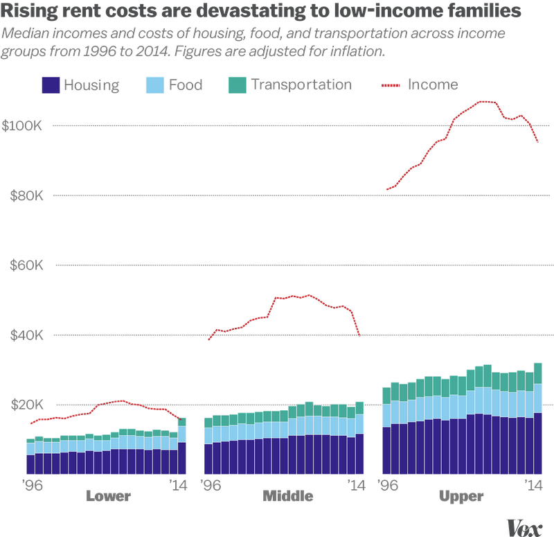
Low-income Americans can no longer afford rent, food, and transportation.
This post was inspired by this Vox article by Soo Oh.
A new Pew Charitable Trusts analysis of data from the Bureau of Labor Statistics shows that in 2013, low-income Americans spent a median of $6,897 on housing. In 2014, that rose to $9,178 — the biggest jump in housing spending for the 19-year period of data that Pew studied. The cost of other necessities, like transportation and food, also rose, albeit not as dramatically. 2014 was the first year that Pew studied in which median spending on these three categories was higher than the median income for those in the lower third of income groups.
Vox created the fantastic plot above to demonstrate how badly lower income families are affected by rising rent, food and transportation costs. I like this plot because it paints a clear picture of an important problem.
Let’s see if we can recreate this plot.
About the data
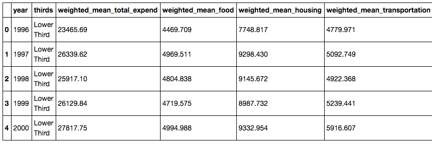
Vox kindly provides the raw data for select data projects on GitHub. We can find the data behind this plot here.
This data includes annual amounts for expenditure on food, housing, transportation, healthcare, entertainment and others. It also contains annual income per year. All metrics are factored into three categories: Lower Third, Middle Third and Highest Third.
Load the data
from IPython.display import Image import matplotlib.pyplot as plt import matplotlib.cm as cm import numpy as np import pandas as pd import seaborn as sns import statsmodels.api as sm from statsmodels.nonparametric.kde import KDEUnivariate from statsmodels.nonparametric import smoothers_lowess from pandas import Series, DataFrame
plt.style.use(‘fivethirtyeight’) %matplotlib inline
Download the csv directly from GitHub and load it into a data frame.

```python
url = "https://raw.githubusercontent.com/voxmedia/data-projects/master/vox-data/pew-household-expenditures-2016.csv"
raw_data = pd.read_csv(url)
raw_data
Get a feel for the data.
raw_data.dtypes
raw_data.columns
Clean the data
Copy raw data into a new data frame for cleaning.
df = raw_data.copy()
Convert the ‘thirds’ column to category type.
df['thirds'] = df['thirds'].astype('category')
We’ll be looking at the median values for now, rather than weighted_mean.
df = df[['thirds','median_total_expend', 'median_food','median_housing', 'median_transportation', 'median_healthcare',
         'median_entertainment', 'median_apparal', 'median_reading','median_retirement_pension',
         'median_cash_contrib', 'median_income']]
Set the proper index to be 1996-2014, for each of the three buckets.
x = range(1996, 2015)
df.index = 3*x
Add semi-total and total columns. We will use this to create a stacked bar plot.
df['housing+food'] = df['median_housing'] + df['median_food']
df['housing+food+transport'] = df['median_housing'] + df['median_food'] + df['median_transportation']
Create three data frames for lower, middle and highest thirds. Reset index and drop old index.
# Create three data frames for lower, middle and highest thirds. Reset index and drop old one.
lower = df[df['thirds'] == 'Lower Third'].reset_index(drop=True)
middle = df[df['thirds'] == 'Middle Third'].reset_index(drop=True)
highest = df[df['thirds'] == 'Highest Third'].reset_index(drop=True)

# Set index to years
lower.index = range(1996, 2015)
middle.index = range(1996, 2015)
highest.index = range(1996, 2015)
Visualize the data
Finally, let’s create the stacked bar plot.
# ==== Design the figure ==== #

# Set general plot properties
sns.set_context({"figure.figsize": (3, 8)})
sns.set_color_codes(palette='muted')
fig, ax = plt.subplots(figsize=(11, 8))
ax.grid(True,linestyle='-',color='0.9')
ax.set_ylim([0,df['median_income'].max()])
ax.axes.get_xaxis().set_visible(False)
ylim = df['median_income'].max() + 10000

# Bigger font sizes for plots
mpl.rcParams.update({'font.size': 18})
mpl.rc('xtick', labelsize=10)
mpl.rc('ytick', labelsize=18)
mpl.rc('labelsize: large')

# ==== Make legend ==== #

leg1 = plt.Rectangle((0,0),1,1,fc="navy", edgecolor = 'none')
leg2 = plt.Rectangle((0,0),1,1,fc='skyblue',  edgecolor = 'none')
leg3 = plt.Rectangle((0,0),1,1,fc='g', edgecolor='none')
leg4 = plt.Rectangle((0,0),1,1,fc='r', edgecolor='none')

l = plt.legend([leg1, leg2, leg3, leg4], ['Housing', 'Food', 'Transportation', 'Income'],
               bbox_to_anchor=(.8,1.01), ncol = 4, prop={'size':16})
l.draw_frame(False)

# Format y axis ticks
def thousands(x, pos):
    'The two args are the value and tick position'
    return '$%iK' % (x*1e-3)
formatter = FuncFormatter(thousands)
ax.yaxis.set_major_formatter(formatter)

# ==== Plot the data ==== #

# Lower plot
ax1=fig.add_subplot(131)
# Bar 1 - background - "total" (top) series
top_plot = sns.barplot(x = lower.index, y = lower['housing+food+transport'], color='g')
# Bar 2 - overlay - "middle" series
middle_plot = sns.barplot(x = lower.index, y = lower['housing+food'], color = "skyblue")
# Bar 3 - overlay - "bottom" series
bottom_plot = sns.barplot(x = lower.index, y = lower['median_housing'], color = "navy")
# Line
income_line = plt.plot(lower['median_income'],'--', color='r')
# Set axes
ax1.set_ylim([0,ylim])
ax1.axes.get_yaxis().set_visible(False)
ax1.set_axis_off()
plt.xticks(rotation=90)

# Middle plot
ax2=fig.add_subplot(132)
top_plot = sns.barplot(x = middle.index, y = middle['housing+food+transport'], color='g')
# Bar 2 - overlay - "middle" series
middle_plot = sns.barplot(x = middle.index, y = middle['housing+food'], color = "skyblue")
# Bar 3 - overlay - "bottom" series
bottom_plot = sns.barplot(x = middle.index, y = middle['median_housing'], color = "navy")
# Line
income_line = plt.plot(middle['median_income'],'--', color='r')
# Set axes
ax2.set_ylim([0,ylim])
ax2.axes.get_yaxis().set_visible(False)
ax2.set_axis_off()
plt.xticks(rotation=90)

# Highest plot
ax3=fig.add_subplot(133)
top_plot = sns.barplot(x = highest.index, y = highest['housing+food+transport'], color='g')
# Bar 2 - overlay - "middle" series
middle_plot = sns.barplot(x = highest.index, y = highest['housing+food'], color = "skyblue")
# Bar 3 - overlay - "bottom" series
bottom_plot = sns.barplot(x = highest.index, y = highest['median_housing'], color = "navy")
# Line
income_line = plt.plot(highest['median_income'],'--', color='r')
# Set axes
ax3.set_ylim([0,ylim])
ax3.axes.get_yaxis().set_visible(False)
ax3.set_axis_off()
plt.xticks(rotation=90)


# ==== Add text ==== #

# Title
title = ax.annotate("Rising rent costs are devastating to low-income families",
            (0,0), (-75, 550), textcoords='offset points', color='gray', fontsize=26, fontweight='heavy')

# Subtitle
ax.annotate("Median incomes and costs of housing, food and transportation across income",
            (0,0), (-75, 525), textcoords='offset points', color='gray', fontsize=18, style='italic')
ax.annotate("groups from 1996 to 2014. Figures adjusted for inflation.",
            (0,0), (-75, 505), textcoords='offset points', color='gray', fontsize=18, style='italic')

# Plot 1 annotations
ax1.annotate("'96", (0,0), (0, -5), xycoords='axes fraction', textcoords='offset points',
             va='top', color='gray')
ax1.annotate("'14", (0,0), (180, -5), xycoords='axes fraction', textcoords='offset points',
             va='top', color='gray')
lower_annotate = ax1.annotate("Lower", (0,0), (70, -20), xycoords='axes fraction', textcoords='offset points',
            va='top', color='gray', fontsize=22, fontweight='bold')

# Plot 2 annotations
ax2.annotate("'96", (0,0), (0, -5), xycoords='axes fraction', textcoords='offset points',
             va='top', color='gray')
ax2.annotate("'14", (0,0), (180, -5), xycoords='axes fraction', textcoords='offset points',
             va='top', color='gray')
ax2.annotate("Middle", (0,0), (70, -20), xycoords='axes fraction', textcoords='offset points',
            va='top', color='gray', fontsize=22, fontweight='bold')

# Plot 3 annotations
ax3.annotate("'96", (0,0), (0, -5), xycoords='axes fraction', textcoords='offset points',
             va='top', color='gray')
ax3.annotate("'14", (0,0), (180, -5), xycoords='axes fraction', textcoords='offset points',
             va='top', color='gray')
ax3.annotate("Upper", (0,0), (70, -20), xycoords='axes fraction', textcoords='offset points',
            va='top', color='gray', fontsize=22, fontweight='bold')

fig.tight_layout()
fig.savefig('/Users/Will/personal-website/assets/2016-05-26-fig3.png', bbox_extra_artists=(l,title, lower_annotate),
            bbox_inches='tight')
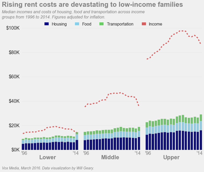
Pretty close!
Check out the jupter notebook here.