Causes of death in New York City
The leading causes of death by sex and ethnicity in New York City in since 2007.
The Department of Health and Mental Hygiene (DOHMH) publishes its data on the leading causes of death in New York City from 2007 through 2011. You may view the data set on NYC OpenData.
This is what it looks like:
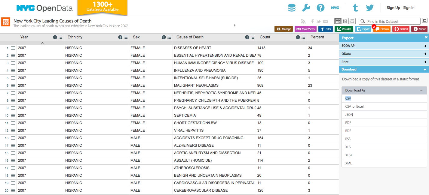
Let’s see what this data tells us about health and death in New York City.
A few data requests for the DOHMH:
- DATE: Please include the dates of each death, rather than simply the year.
- AGE: Please include the age of individual at their time of death.
Below, let’s use Python and several of its popular libraries to load, clean and explore the data.
Set up the environment
Import the necessary libraries.
from datetime import datetime
from IPython.display import Image
import matplotlib.pyplot as plt
import matplotlib.dates as mdates
import matplotlib
import numpy as np
import os
import pandas as pd
import seaborn as sns
%matplotlib inline
Set some visual parameters.
# Bigger font sizes for plots
matplotlib.rcParams.update({'font.size': 32})
matplotlib.rc('xtick', labelsize=16)
matplotlib.rc('ytick', labelsize=12)
matplotlib.rc('labelsize: large')

# Do not truncate dataframe displays up to 500 columns
pd.set_option('display.max_columns', 500)
Load the raw data
Download the csv directly from the NYC Open Data site and load it into a data frame.
# Upload image
url = 'https://data.cityofnewyork.us/api/views/jb7j-dtam/rows.csv?accessType=DOWNLOAD'
raw_data = pd.read_csv(url)
Preview the DataFrame and see what dtypes its columns are.
raw_data.head()
raw_data.dtypes
Clean the data
Assign the raw_data to a new DataFrame for cleaning.
df = raw_dataConvert columns to their appropriate dtypes. We’ll want Ethnicity, Sex and Cause of Death to be categorical.
# Convert categorical columns to categories
df['Ethnicity'] = df['Ethnicity'].astype('category')
df['Sex'] = df['Sex'].astype('category')
df['Cause of Death'] = df['Cause of Death'].astype('category')

# Convert Percent column to an actual percent
df['Percent'] = df['Percent']/100
Sort the data chronologically.
# Sort by year
df.sort_values(by='Year', inplace=True)

# Reset index
df.reset_index(drop=True, inplace=True)

df.head()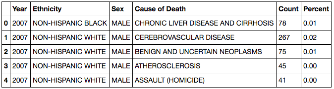
Explore the data
See what categories (and how many) there are for each categorical column.
ethnicities = list(np.unique(df['Ethnicity']))
sex = list(np.unique(df['Sex']))
causes = list(np.unique(df['Cause of Death']))

print 'Ethnicities ({}):'.format(len(list(np.unique(df['Ethnicity'])))), ethnicities
print ""
print 'Sex ({}):'.format(len(list(np.unique(df['Sex'])))), sex
print ""
print 'Cause of Death ({}):'.format(len(list(np.unique(df['Cause of Death'])))), causes
Use groupby and sum calculate the absolute number of deaths by category by year.
men = df[df['Sex'] == 'MALE']
women = df[df['Sex'] == 'FEMALE']

g_ethnicity = df['Count'].groupby([df['Year'], df['Ethnicity']]).sum().unstack()
g_sex = df['Count'].groupby([df['Year'], df['Sex']]).sum().unstack()
g_cause = df['Count'].groupby([df['Year'], df['Cause of Death']]).sum().unstack()

g_ethnicity_men = men['Count'].groupby([men['Year'], men['Ethnicity']]).sum().unstack()
g_ethnicity_women = women['Count'].groupby([women['Year'], women['Ethnicity']]).sum().unstack()
Make some intital plots.
g_ethnicity.plot(kind='bar', figsize=(10,5))
plt.legend(loc='center left', bbox_to_anchor=(1.0, 0.5))
plt.title('Total Death Count by Ethnicity in NYC', fontsize=18)
plt.xlabel('Year',fontsize=14);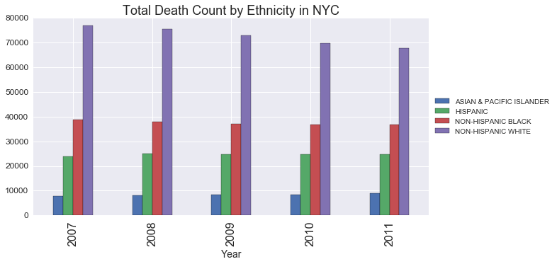
g_ethnicity_men.plot(kind='bar', figsize=(10,5))
plt.legend(loc='center left', bbox_to_anchor=(1.0, 0.5))
plt.title('Total Death Count for Men by Ethnicity in NYC', fontsize=18)
plt.xlabel('Year',fontsize=14);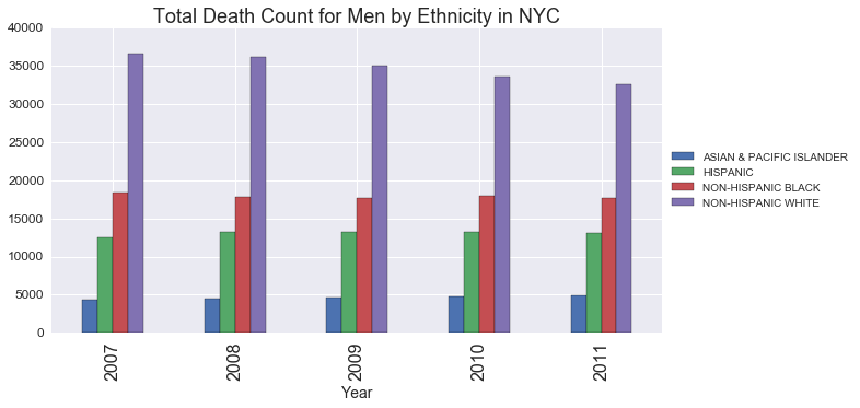
g_ethnicity_men.plot(kind='bar', figsize=(10,5))
plt.legend(loc='center left', bbox_to_anchor=(1.0, 0.5))
plt.title('Total Death Count for Women by Ethnicity in NYC', fontsize=18)
plt.xlabel('Year',fontsize=14);
g_sex.plot(kind='bar', figsize=(10,5))
plt.legend(loc='center left', bbox_to_anchor=(1.0, 0.5))
plt.title('Total Death Count by Gender in NYC', fontsize=18)
plt.xlabel('Year',fontsize=14);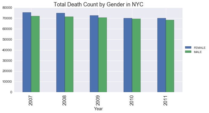
g_cause.plot(kind='bar', figsize=(10,5))
plt.legend(loc='center left', bbox_to_anchor=(1.0, 0.5))
plt.title('Total Death Count by Cause of Death in NYC', fontsize=18)
plt.xlabel('Year',fontsize=14);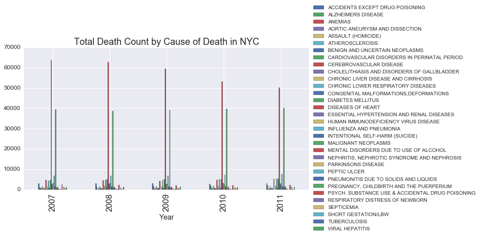
While the Cause of Death chart above isn’t very useful right now, it does suggest that two of the causes are much more common than the others. There are too many bars to see - but I’m going to guess that heart disease and cancer (i.e. malignant neoplasms) are the most common causes.
It’s also interesting to note that the most common cause of death (which appears to be heart disease) is steadily declining from 2007 through 2011.
Let’s start by examining the biggest cause of death: heart disease.
heart_disease = df[df['Cause of Death'] == 'DISEASES OF HEART']
g_heart_disease = heart_disease['Count'].groupby([heart_disease['Year'], heart_disease['Ethnicity']]).sum().unstack()
g_heart_disease.plot(kind='bar')
plt.legend(loc='center left', bbox_to_anchor=(1.0, 0.5))
plt.title('Deaths from Heart Disease in NYC', fontsize=18)
plt.xlabel('Year',fontsize=14);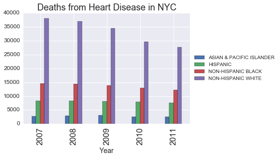
Deaths from heart disease among white people decreased -27% from 2007 to 2011.
Deaths from heart disease among black people decreased -16% from 2007 to 2011.
Deaths from heart disease among hispanic people decreased -7% from 2007 to 2011.
Deaths from heart disease among asian people decreased -8% from 2007 to 2011.
It turns out that deaths from heart disease has been dropping steadily in America since 1970. One doctor attributes this trend to healthier diets, more exercise, reductions in cigarette smoking, use of high-blood pressure medication and widespread acceptance of statin drugs to control cholesterol levels (read more here).
Deaths from heart disease in New York has dropped the most for white people. Why is that?